
What Colours Work in a Hand Painted Kitchen?
Match the undertone before you match the shade. Almost every kitchen colour that looks wrong on the wall is the right depth with the wrong undertone sitting beside it.
Choose the wall colour by matching the undertone of the cabinets rather than the depth. Warm greys, cashmere, cream and pebble all sit under warm off whites and soft stone shades. Cool greys and dove grey sit under crisp whites and pale blue greys. Sage green needs warmth beside it, so pair it with a warm off white rather than a cool one. In a north facing London room, which most rear kitchens are, cool greys turn leaden and warm neutrals hold up far better.
Undertone beats shade
There is no such thing as plain grey. Every grey leans somewhere. The lean is what decides whether two colours sit happily together. The four families you will meet are blue grey, green grey, violet grey and greige, which leans brown.
Put a blue grey wall next to a greige cabinet and the wall reads as cold and the cabinet reads as dirty. Neither colour is wrong. They are simply arguing. Put a greige wall with a greige cabinet at a different depth and the room settles immediately.
The practical test costs nothing. Paint two A4 boards, hold them side by side in the actual room, then turn them ninety degrees to catch different light. Undertone clashes are obvious within seconds and almost impossible to see from a screen or a small swatch.
What colour goes with grey kitchen units?
Grey is the most searched question and the most likely to go wrong, because the answer depends entirely on which grey you have.
| Your grey | How to spot it | Wall colours that work | Avoid |
|---|---|---|---|
| Cool blue grey | Reads slightly blue beside white paper | Crisp white, palest blue grey, soft mid grey | Cream, magnolia, anything yellow based |
| Dove grey | Soft, slightly warm, no strong lean | Warm off white, pale stone, mushroom | Stark brilliant white, strong blue |
| Greige | Reads brown or beige beside white paper | Warm off white, oatmeal, soft clay | Cool grey, blue white |
| Charcoal | Very dark, undertone hard to see | Pale warm white, soft plaster pink, pale sage | Another dark colour on all four walls |
| Green grey | Reads slightly green in daylight | Warm white, pale sage, soft stone | Pink based neutrals |
Hold a sheet of plain printer paper against your cabinet door in daylight. Printer paper is close to neutral cool white. Whatever your cabinet colour appears to lean towards next to it is its undertone. That single test settles most colour arguments in about ten seconds.
Worktops follow the same rule. A cool grey stone beside a warm cream door is the pairing we are most often asked to correct. Full worktop pairings are in Choosing a Kitchen Worktop.
Pairings for the other popular unit colours
| Cabinet colour | Undertone | Wall colours that work | Accent that lifts it |
|---|---|---|---|
| Cream | Warm yellow | Warm white, soft buttermilk, pale stone | Aged brass, oak, black ironmongery |
| Cashmere | Warm greige | Warm off white, oatmeal, soft taupe | Brushed brass, walnut, deep green |
| Pebble | Soft warm grey | Warm white, pale mushroom, soft clay | Antique brass, oak, cream stone |
| Dove grey | Neutral to slightly warm | Warm off white, pale stone | Chrome, nickel, pale timber |
| Sage green | Warm green | Warm off white, soft cream, pale clay | Aged brass, oak, cream worktop |
| Deep green | Cool to mid green | Warm white, soft plaster, pale stone | Brass, marble, black |
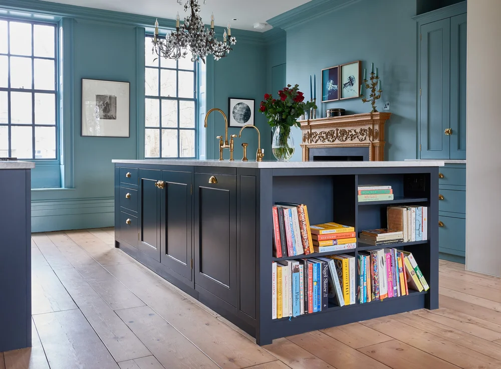
| Navy | Cool blue | Crisp white, pale warm grey | Brass, oak, white stone |
| Off white or bone | Varies | Almost anything a shade deeper | Any metal, any timber |
Sage green is worth a note because it is the colour we are asked about most after grey. It carries a warm yellow green base, so a cool grey wall makes it look grey itself and kills the green entirely. A warm off white beside it lets the colour read properly.
Cashmere and pebble are close relatives, both warm greige. Neither works under a cool white. Both look expensive under a warm off white with a warm stone worktop.
Hand painted in any colour, matched to your room
We spray and hand finish in the workshop, so you are not limited to a range card. We will paint sample doors in your chosen colours and leave them in your kitchen to look at in real light. Across Islington, Hackney, Barnet, Haringey, Enfield and Walthamstow.
London light changes everything
Most rear kitchens in North London terraces face north or east, which means cool blue toned daylight for most of the day. That light strips warmth out of a colour rather than adding it.
| Aspect | Quality of light | Choose | Avoid |
|---|---|---|---|
| North facing | Cool, blue, consistent, never direct | Warm greys, cream, greige, warm whites | Cool greys and blue whites, they go leaden |
| East facing | Warm early, cool from midday | Warm neutrals, soft greens | Anything relying on afternoon warmth |
| South facing | Warm and bright most of the day | Cool greys, crisp whites, deep colours | Strong yellows, they overheat |
| West facing | Cool morning, warm golden evening | Most colours work, test at both times | Very warm creams, they glare at dusk |
| Side return with rooflight | Bright, neutral, top lit | Almost anything, this is the easiest light | Very dark on all four walls |
This is the reason a colour that looked beautiful in a showroom looks disappointing at home. Showrooms are lit with warm artificial light at high levels. A north facing rear kitchen in February is a completely different environment.
Light Reflectance Value is the number worth asking about. It runs from zero for black to one hundred for pure white. Below about thirty five, a colour will make a north facing room feel noticeably darker. Above about seventy it will bounce light around. Most paint manufacturers publish the figure for every colour.
Can kitchen units be painted?
It depends entirely on what they are made of. This is where a lot of money gets wasted.
| Door type | Can it be painted? | What is involved |
|---|---|---|
| Solid timber | Yes, very well | Degrease, sand, prime, two topcoats |
| Painted MDF or timber frame | Yes, ideally | Light sand to key, one primer coat, two topcoats |
| Bare or primed MDF | Yes | Seal the edges properly, they drink paint |
| Veneered board | Yes, with care | Grain may show through, needs a grain filler for a flat finish |
| Foil wrapped or vinyl | Not reliably | Paint sits on plastic film, chips at every edge and the film keeps lifting |
| High gloss acrylic | Not reliably | Needs specialist adhesion primer and still marks easily |
| Melamine faced | Poorly | Requires an adhesion primer, wears through at handles within a couple of years |
The honest position is that repainting works beautifully on the materials bespoke kitchens are made from and works badly on the materials budget kitchens are made from. That is one of the real long term arguments for the more expensive door, as set out in What Kitchen Cabinets Are Made From.
A workshop repaint of an existing bespoke kitchen typically costs four to eight thousand pounds for a full room, doors removed, sprayed and rehung. Against a replacement that is a fraction of the cost. It is the single most effective way to update a kitchen that is structurally sound.
Sheen and why it matters more than people expect
The finish level changes how a colour reads as much as the colour itself does. Hand painted kitchens are almost always finished in eggshell.
- Matt, under 10 per cent sheen. Beautiful depth of colour, marks easily, hard to clean. Suitable for a larder interior rather than a working run.
- Eggshell, around 20 per cent. The standard for hand painted kitchens. Enough sheen to wipe down, little enough to keep the colour soft.
- Satin, around 40 per cent. More durable and easier to clean, though it reflects more and flattens subtle colours.
- Gloss, over 70 per cent. Very durable, shows every imperfection in the substrate and every fingerprint in use.
Eggshell on the cabinets with a matt emulsion on the walls is the pairing that reads best, because the slight difference in sheen separates the joinery from the wall without needing a difference in colour.
Colours that date and colours that do not
A hand painted kitchen can be recoated, so a colour choice is less permanent than it feels. It is still worth knowing which decisions age well.
| Choice | How it ages | Comment |
|---|---|---|
| Warm off whites and creams | Very well | Almost never look wrong, easy to live with |
| Greige, cashmere, pebble | Very well | Quiet warm neutrals have outlasted every trend |
| Deep muted greens and blues | Well | Read as considered rather than fashionable |
| Dove grey and soft warm greys | Well | The warm end of grey has aged far better than the cool end |
| Cool trend greys of the late 2010s | Poorly | The most obviously dated kitchen colour of the last decade |
| Strong accent colours on every unit | Poorly | Better as an island or a single run |
| Very dark on all four walls | Depends on light | Works in a bright top lit room, oppressive in a north facing one |
The safest approach in a period London house is quiet warm neutrals on the main runs with one deeper colour on an island or a larder. That gives the room character without committing the whole kitchen to a decision you may tire of.
Door construction affects how a colour reads too, because a five piece frame casts a shadow line that gives flat paint depth. What Is a Shaker Kitchen explains why. Kitchen Lighting Guide covers the lighting that makes or breaks a colour.
More on finishes and specification
Colours, door styles, worktops, lighting, materials and budgets, written for people commissioning a kitchen rather than buying one. Everything sits in our Bespoke Kitchen Guides library.
Frequently asked questions
What colour goes with grey kitchen units?
It depends on which grey. Cool blue greys take crisp whites and pale blue greys, while greige and dove grey take warm off whites, pale stone and mushroom. The mistake to avoid is mixing temperatures, so a cream wall beside a cool grey unit or a cool white beside a greige unit. Hold plain printer paper against the door to see which way your grey leans.
What colour walls go with sage green kitchen units?
Warm off white, soft cream or pale clay. Sage carries a warm yellow green base, so a cool grey or a blue white wall drains the green out of it and makes the units look grey instead. Aged brass ironmongery and an oak or cream toned worktop finish it well.
What colour goes with cashmere or pebble kitchen units?
Both are warm greige, so they need warm neutrals beside them. Warm off white, oatmeal, soft taupe and pale mushroom all work. Avoid cool whites and blue greys, which make both colours look muddy. Brushed brass, walnut and warm stone worktops all sit well with them.
What colour should I paint my kitchen?
Start with the aspect. Most rear kitchens in London terraces face north or east and receive cool blue daylight, which suits warm greys, creams and greige and punishes cool greys. Then match the undertone of the walls to the undertone of the units. Check the Light Reflectance Value too, since anything below about thirty five will darken a north facing room.
Can kitchen units be painted?
Solid timber, painted MDF, timber frame doors and bare MDF all take paint very well. Foil wrapped, vinyl, high gloss acrylic and melamine faced doors do not, because the paint sits on a plastic film and chips at the edges. A workshop repaint of a bespoke kitchen typically costs £4,000 to £8,000 for a full room.
What sheen should a hand painted kitchen be?
Eggshell, at around twenty per cent sheen, is the standard. It has enough sheen to wipe clean and little enough to keep the colour soft. Matt marks too easily for a working kitchen, satin flattens subtle colours and gloss shows every imperfection. Eggshell cabinets against matt emulsion walls is the pairing that reads best.
Where to go next
Colour is the decision people agonise over and the one that is easiest to change later on a hand painted kitchen. Get the undertone right, test in the actual room at two times of day, then commit. Our Bespoke Kitchens North London page shows recent hand painted work in North London houses.
More from this guide series
- Choosing a Kitchen Worktop for worktop and cabinet pairings
- What Is a Shaker Kitchen for how a frame gives paint depth
- Kitchen Lighting Guide for lighting that shows colour properly
- What Kitchen Cabinets Are Made From for which doors can be repainted
- Is a Bespoke Kitchen Worth It for repainting against replacing
- Bespoke Kitchen Guides for every guide in the series
Tell us which way your kitchen faces and what is on the floor. Those two answers narrow the colour choice more than any inspiration folder.